
What is the MACD?
The Moving Average Convergence Divergence (MACD) is a lagging (trend-following) momentum indicator demonstrating the relationship between two moving averages of an asset’s price.
How is the MACD calculated?
This technical indicator draws on two particular moving averages: the faster EMA (exponential moving average) and the slower EMA. Specifically, the MACD subtracts the slower EMA from the faster EMA to determine whether the momentum of a trend is increasing or decreasing.
The default and typical value for the faster EMA is 12 days and the default and typical value for the slower EMA is 26 days. The 12-day EMA translates as fast based on shorter-term trends and thus its value changes more quickly. The 26-day EMA translates as slow because longer-term trends and thus its value change more gradually.
How do you read the MACD?
When looking at an MACD chart, look at two main lines: the MACD line (usually blue) and the signal/trigger line (usually orange). The MACD line plots the difference between the slower EMA and the faster EMA. The signal line plots an EMA (usually the 9-day EMA) of the MACD.
Traders often look at the relationship between these two lines in order to determine buy or sell signals. When the MACD line crosses above the signal/trigger line, traders see that as a potential cue to buy and call the market bullish. The market is considered bearish when the MACD line crosses below the signal line, a potential indication to sell. These types of signals are called crossovers.

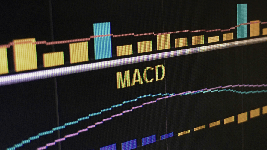
Understanding the MACD Histogram
Included in an MACD chart is also a histogram plotting the difference between the MACD and its EMA plotted as the signal/trigger line (usually its 9-day EMA). The histogram looks like a bar graph, only it goes both above and below the zero line, also known as the centerline. When the MACD is above its signal/trigger line (often its 9-day EMA), the histogram displays a positive/above zero value and a bullish market. When the MACD lands below its signal/trigger line, the histogram displays a negative/below zero value and a bearish market.
The MACD histogram also reads as a momentum indicator. Prices in fluctuation constantly reverberate between extremes, though for the most part staying within the same range. When a histogram’s value sets far from the centerline/zero line, typically that indicates strong momentum in one direction or another. A highly positive histogram could confirm the strength of a bullish momentum. A plunging low indicates a bearish momentum. However, momentum can change from instance to instance, often moving based on more qualitative changes or fundamental indicators.
Because the value of things change through time due to significant events, momentum in a particular direction does not guarantee the continuation of a trend. What goes up must (or usually does) come down, or at least levels off to a plateau based on demand.

The MACD chart also determines if an asset is overbought or oversold. When the MACD line is diverging from the signal line while above it, traders read this as the market price overextending or as the asset being overbought, a potential indication that it may go back down soon. When the MACD diverges from the signal line while below it, it means the market price projects as undervalued or as oversold, indicating that it (the MACD line) may go back up soon.
There are also different types of divergences that can be used as indicators. For example, a bullish divergence records a lower low on the candlestick chart relative to the prior lows but the MACD records a higher low on the MACD chart relative to the prior lows. This indicates that the downward momentum of the asset is slowing. As you may have guessed, bearish divergences display the opposite conditions.
A bearish divergence occurs when an asset records a higher high on the candlestick chart relative to the prior highs but the MACD records a lower high on the MACD chart relative to the prior highs, indicating the slowdown of upward momentum. Bullish and bearish divergences can foreshadow the reversal and/or decline of a trend.

MACD parameters typically require and display a particular formula of three numbers with commas between them. The first number signifies the number of periods used to calculate the fast moving average. The second number stands for the number of periods used to calculate the slow moving average. While the third number represents the amount of periods used to calculate the moving average that forms the signal/trigger line (calculated as the difference between the fast and slow moving averages). The most common MACD parameters “12, 26, 9” represent the periods of time these often stand for in days. Therefore, in this example, a 12-day fast moving average, 26-day slow moving average and 9-day moving average exhibit the difference between the fast and slow moving averages.
Some Traders Mix it Up
Some traders use the MACD manually on several platforms while automating their MACD trades using Capitalise. Capitalise’s platform redefines trading automation, empowering traders to automate their own unique trading plans using natural language. Simply write if-then strategies in plain English and Capitalise monitors the market and executes trades from entry to exit.
Setting up a Strategy using the MACD
In order to use MACD in a strategy in Capitalise, type “If the MACD Line”, and a widget will pop up above “the MACD Line” with fields to fill out. Next to “Fast”, type the number of periods you want to use to calculate the fast moving average. Then next to “Slow”, type the number of periods you want to use to calculate the slow moving average. On to “Signal”, then enter the number of periods you want to use to calculate the signal/trigger line (plots the moving average of the difference between the faster and slower moving averages).
After setting the first three parameters, next to “BarPeriod”, enter the period of time by which your moving averages intends to be calculated. Choose from options ranging from 1m (1 minute) to Day (1 day). In “BarPrice”, choose which price within the period of time specifies what you want used in the calculations. “Close” means the closing price and typically here you can also choose the Open, High, and Low of the period.

Once you’ve entered all this information in, press the “OK” button within the widget. Move on to describe the rest of your strategy. What position makes sense for the MACD line? What movement do you want it to take relative to the signal line? Then determine the action you want taken once that position or movement meets your criteria.
An Example of an Automated MACD Trading Strategy
Here’s an example of a MACD-dependent strategy you can create with Capitalise. The crossing above indicator works as the only condition or pairs with as many other conditions as you would like to add.

Why use the MACD?
The MACD provides an advanced trading tool that gives traders insight into when and how to enter and exit trades. Many traders regularly use the MACD as one of their more reliable indicators. The MACD may be simple to read even though it’s more complex to calculate than some other moving averages.
Please note that examples provided here purely illustrating how to use the MACD. Examples serve as just that and in no way intend to serve as trading advice. This content intends to inform and educate only. Examples should not be considered investment advice or investment recommendation. Past performance is not an indication of future results. Read more here
We hope you learned something and encourage you to look at current MACD charts for yourself. Once you get the hang of it, you can try it even in simulation mode using Capitalise. Happy trading!

