
Most traders don’t make their best trades based on intuition alone. In fact, there’s a science to improving your chances of trading success, referred to as technical analysis. Technical analysis looks at the past to predict the future. And while it’s easy to kick yourself for missed opportunities (we all know hindsight is 20/20), technical analysis allows you to draw on the past so you can pounce on them in the future.
Technical analysis is a group of quantitative approaches traders use to analyse market movements. It allows them to isolate trends to make educated predictions and wiser trading decisions.
Comprised of technical indicators, technical analysis derives the maximum information from asset prices using economic principles. It analyses the history of an asset’s price charts and trading volumes to help traders make educated guesses about how its price will move.
Another way people look at the market is by using fundamental analysis, which determines whether an asset is over or undervalued based on more qualitative factors, such as recent news stories and regulatory issues.
In this blog, we break down technical analysis for you and give you an introduction to the basic technical indicators.
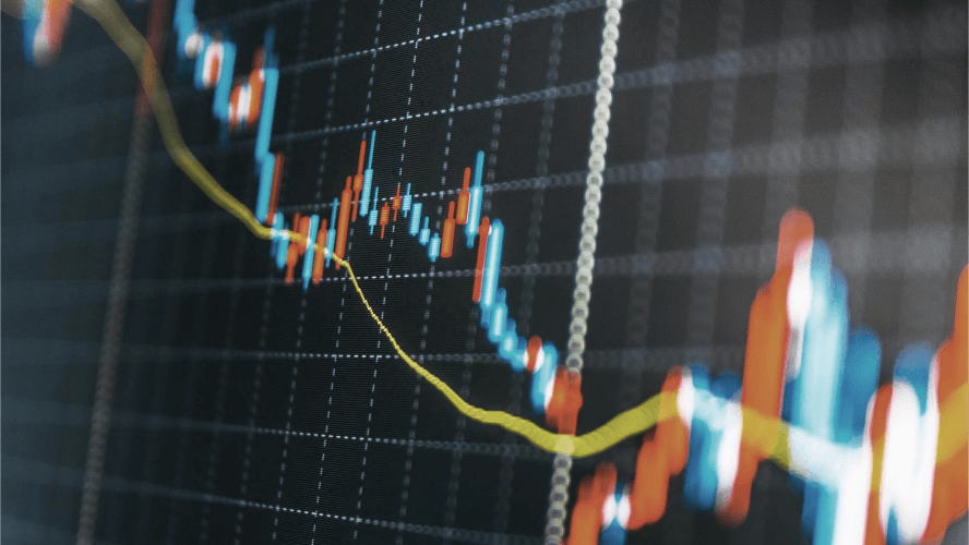
Reading the chart candles
First, you’ll want to familiarize yourself with candlestick charts. The illustration below shows how to read them.

Each chart represents a specific period of time with candles representing smaller time periods within the chart’s timeframe. When a candle is red, that means the asset closed on a lower price than what it opened with and when a candle is green, the asset closed on a higher price than it opened with. Each candle on a candlestick chart may have one or two shadows, or wicks. These are lines extending past the opening or closing price indicating fluctuations during that period of time higher or lower than the opening and closing prices.
Trend Lines
Trend lines describe the direction in which an asset is trending over time. They are more difficult to isolate for assets with large price instability and high volatility, such as cryptocurrencies.
Yet, trend lines are designed to smooth out the volatility of an asset, helping traders understand the price movement over a specified period of time. Like any graph, graphs of trend lines show a positive slope if prices are increasing, and a negative slope if prices are decreasing. Traders overlook volatility and find an upward trend if they observe a series of higher highs or a downward trend if they observe a series of lower lows. The trend line can also be straight, which signifies a steady price of the asset, also known as consolidation.

Support and Resistance Levels
Trends usually oscillate between a certain low and high that they don’t cross, often drawn on the chart as support and resistance lines. These boundaries act as a kind of floor and ceiling (respectively) for the price of any given asset. Understanding support and resistance levels allows traders to accurately identify potential opportunities for both the short term and the long term.
The support line is set by buyer demand and identifies the point at which downtrends reverse and become uptrends. The more incidents of a support level changing the direction of a trend in the past, the stronger the support line is, and the more incidents of a resistance line reversing the upward momentum of a trend downwards, the stronger it is. These levels can be useful for traders in setting trade entry and exit positions.

Moving Average
The Moving Average (MA) is a widely used indicator that helps traders better understand the direction of a trend. It’s simply the average price of an asset over a predetermined period of time. For example, you can find the 10-day moving average by calculating the average price of an asset for each of the past 10 trading days.
It is one of the simplest yet most powerful technical indicators. Once the moving average has been plotted on the chart, it can be used to help traders spot trends.
But not all moving averages are the same. Generally speaking, they fall into two main categories: simple moving averages (SMA) and exponential moving averages (EMA). The SMA finds a basic average of an asset’s price over a defined number of time periods. When calculating the EMA, however, more recent price values are given more weight mathematically.
If you’re totally new to technical analysis, we recommend starting by looking at longer-term MA. For instance, 50, 100, and 200 days. But regardless of the timeline, the underlying calculations for moving averages always remain the same.
Example of a 50 day simple moving average:

Trading Volume
Trading volume is the amount of money changing hands for a specific asset over a particular period of time. High trading volume usually means higher liquidity and better order execution.
Every time a trader analyses the market based on one or more technical indicators, they’ll often check the volume level as well, informing their decision to trade. For instance, if an asset has a strong upward trend but the volume suddenly decreases, it’s likely that the trend will reverse and turn downward.
As mentioned, you can find the volume levels at the bottom of each chart. Watch for significant candles that might indicate something about the larger trend.

Popular Technical Indicators
Moving Average Convergence Divergence (MACD)
The MACD shows the relationship between two moving averages. Traders can use it to isolate trends. The movement of the MACD Line relative to the signal/trigger line signals whether traders should buy or sell the asset in question.
In general, there are three types of movements observed using MACD: crossovers, divergence, and whether an asset is overbought or oversold. Crossovers occur when the MACD rises or falls below the signal line, indicating a bullish or bearish market, respectively. A bullish divergence is when an asset records a lower low but the MACD records a higher low. This indicates that the downward momentum of the asset is slowing. As you may have guessed, the opposite is called a bearish divergence. A bearish divergence occurs when an asset records a higher high but the MACD records a lower high, indicating the slowdown of upward momentum.
The MACD chart can also be used to determine if an asset is overbought or oversold. When the MACD is rising, it means the market price is overextending or that the asset is overbought, and therefore that it may go back down soon. When the MACD is falling, it means the market price is undervalued or that the asset is oversold, indicating that it may go back up soon.
In the following image, we observe the MACD Line crossing above the trigger line, which many traders consider a signal to buy an asset.

Relative Strength Index (RSI)
Traders use RSI to determine whether an asset is overbought or oversold. RSI is also a momentum indicator calculating the significance of recent price changes. Its value ranges between 0 and 100. Above 70 indicates that the asset is overbought, while below 30 indicates that it is oversold. The RSI was introduced by J Welles Wilder in 1978 in his book, “New Concepts in Technical Trading Systems”. It’s too complicated to cover here, but if you’d like to read more about it, we recommend checking out this Investopedia article.
The following chart shows the RSI for 14 days:

Bollinger Bands
Bollinger Bands help determine volatile and stable conditions in the market. The bands are calculated through standard deviation, and they expand during volatile times and contract under stable conditions. If the price of an asset approaches the higher band it is believed that it is overbought, and the converse holds true for the lower band; the asset is oversold.
Of course, technical analysis isn’t everything. For best results, savvy traders combine relevant information from technical analysis with fundamental analysis for more holistic look at the market, helping them to make wiser investment decisions.

Get to know some tools to start you off:
TradingView is a great free resource to start with. TradingView displays charts and adds analysis such as trend lines and most other technical indicators. TradingView charts can also be viewed within Capitalise.
Capitalise is a platform that is redefining trading automation, empowering you to automate your own unique trading plans using natural language. You simply write if-then strategies in plain English and Capitalise monitors the market and executes your trades from entry to exit. This liberates you from emotionally influenced trading decisions that can undermine a hard-won plan and saves you hours spent staring at the screen nervously anticipating a specific scenario. Capitalise is a one-stop shop to follow, control, and execute trades via multiple exchanges or brokers, in both traditional and crypto markets. Check it out here: https://app.capitalise.ai/wizard

